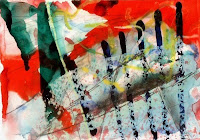
"For me, the greatest pleasure of all, is that long standing devotion to that long, large, tall white canvas. It's a labor of love, you know, as if you are walking over the surface of this terrific continent..." -Sam Francis
It's official. Abstract Expressionism is my favorite movement. (Oh how American of me!) Color Field, Gestural, I love it all because when looking at a painting I am drawn, first and foremost, to color and motion, or movement, two defining Abstract Expressionist traits.
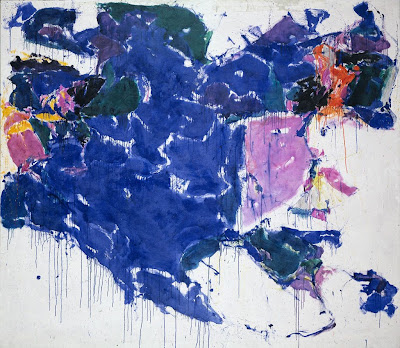
In what is essentially the basement of the Hirschhorn, (a museum whose space I don't particularly love, although my recent private tour of their mind blowing Yves Klein show by fellow PGC intern, and current Hirschhorn intern, Mark Rosen, did make me think otherwise,) is a map-like Ab-Ex painting that I have always been attracted to because of its beautiful colors, which rest on a defining, clean white background.
I never thought much about the artist of the painting, because, for better or worse, I often deliberately neglect to look at the text panels on museum walls. (It's part of my whole riff on empowering the viewer to have confidence in his interpretations and find value in art apart from the name of its artist.) That was until this May when a Sam Francis show opened at the Helly Nahmed Gallery, which I pass everyday on my way to Gagosian. In the window of the Nahmed Gallery hangs a large banner stating "Sam Francis". Upon my very first glance into the gallery, I learned: favorite Hirschhorn painting = Sam Francis. I tend to stay away from equating artists with their works, (or to paraphrase Rothko in RED, which I saw last night, 'I hate when people use my name as a noun,') but the nature of the sign in the Nahmed window disabled me from separating Francis from his work, thus encouraging me to learn about Francis and the light his history might shed on his paintings. (Roland Barthes, writer of "Death of the Author," would kill me for saying that...)
To start, Francis was a California boy born in San Mateo in the 20's. In the 50's he moved to Europe for a bit to study, returning to California in the 60's for the last nearly forty years of his life, which is when he produced many of his iconic works. This fact about Francis' background is apparent from one's very first glance at the works in the Nahmed Gallery show. Unlike the inspiring Francis painting from the Hirschhorn, most Fracis paintings on display at the Nahmed Gallery, have a typical 80's L.A. look - think fine art inspired by Saved by the Bell, Johnny Rockets, or a Midwestern diner modeled in that style and not updated since.
However, other Francis works, such as the one above called Blue out of White(1958), have this ideal balance between the styles of Mark Rothko and Jackson Pollock. This is a controversial statement, as many believe that Francis' rise to success came from his vastly different approach to painting than Rothko and Pollock, however undoubtedly they were two of Francis' influences, and in my eyes, Francis has Rothko's profound color sensibility, (a complimentary label that the angry Rothko despised,) and Pollock's motion, his drive for action...
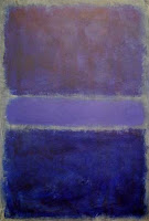
Unfortunately, Blogger makes it difficult to place images side by side, but if you look at Francis' Blue Out of White and then the two Rothko's I have placed near this paragraph, you will notice that they use similar, almost complimentary colors. (This example being one of many possible comparisons.) In fact, both artist's believed that their purpose was to express human emotion, which in a visual idiom can be achieved through the employment of colors.
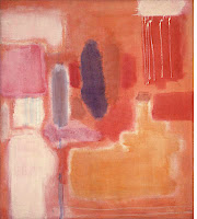
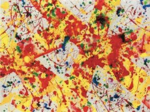
As for the Francis/Pollock comparison, watch the video below and you will see that Francis paints much like Pollock, standing over his canvas, walking around it, using large gestures. (Scroll down to watch a Pollock clip that looks quite similar...)
Yet Francis' unique spin on Ab-Ex is the map-esque feeling he creates through his captivating white backgrounds and frequent use of blue. As the daughter of Irwin Kula, and an Upper West Side kid unavoidably influenced by Freudian psychology, I felt in my bones that that feature has symbolic, if not unconscious, value.
Lo and Behold, my inkling was partially true. (I think I should start capitalizing the first letters of the words Partial Truth, since in my family those words are practically sacred, worthy of proper noun status.)
I say Partially True because Francis was associated with a movement called Tachiste, which some people call the European counterpart to Abstract Expressionism. The movement has not been widely written about, so understanding its precise premise has been a bit of a difficult task for me. Of the movement, the Hollis Taggart Gallery's website says "Artists in the group developed a style of gestural action painting that reflected an expressive, painterly aesthetic and the artists' desire to highlight the beauty of their materials, as opposed to portraying psychological or philosophical concerns." According to this understanding of Tachiste, works produced by artist's of the movement are essentially void unconscious intentions.
However, unable to accept the notion that Francis' works have no psychological implications, I further investigated the Tachiste movement and found that the Taggart Gallery's description was not quite right. The Tachiste movement is based on the longing to express, or create the artist's mark. In fact, it's related to the Art Informal movement, which is premised on the importance of depicting the artist's inner being, whatever that might mean...
Francis' affiliations with those movements closely ties to the map-like feeling of his paintings, a quality I've mentioned several times. Francis was inspired by a Jungian therapy technique that helped him recall his dreams that often related to nature, particularly water and air, levitation and gravity.
Yet that is not the only possible meaning of Francis' paintings' earthly feelings. In an Art in America article published last year called "Best in the Studio: The Art of Sam Francis," author Darrell Hartman suggests that Francis began prioritizing negative space as a means of creating portals into new dimensions, after learning about the Japanese ma.
I'd like to suggest, perhaps more simply than other interpretations I've noted, that Francis' map-like creations stem from his conscious or unconscious recognition that his style was influenced by a number of cultures from across the globe. After all, he was born on the west coast of the U.S.; he spent time in France where he learned about Japanese culture and determined to travel to Japan to learn about different forms of Buddhism; he studied Jungian psychology, which is of Swiss origins; and his role models were Pollock who himself was influenced by Mexican and Native American cultures, Rothko who was Eastern European, and Clyfford Still who lived all over North America.
Perhaps we'll never know the answer, or perhaps this is another case of the Partial Truth, but in an effort to search, I'm off to watch the 2008 documentary The Painter Sam Francis.
1. Sam Francis, Blue Out of White, 1958. Oil on canvas. Hirschhorn Museum and Sculpture Garden, Washington D.C.
2. Sam Francis, Untitled, 1992. Acrylic on paper. Helly Nahmed Gallery, New York City.
3. Mark Rothko – unfortunately I can’t find the tombstone information for this work online…
4. Mark Rothko, Untitled, No. 9, 1948, oil on canvas.