Check this out! Architects from around the world are currently competing for most appealing sukkah design. Twelve winners have been selected to have their sukkas fabricated and placed in Union Square for all to see until October 2. Through this process, people have the opportunity to learn about different types of architecture and to think about the meaning of this ancient holiday, which in the contemporary idiom serves to remind us how lucky we are to have such bountiful harvests / so much to eat, and remind us of our obligation to help those less fortunate than us, though who might permanently live in temporary shelters... Talk about how art can be a vehicle that adds meaning to life...
P.S. In my book the 900 sukkah will always be the winner!
Showing posts with label Accessible Art. Show all posts
Showing posts with label Accessible Art. Show all posts
Wednesday, September 15, 2010
Sunday, August 1, 2010
Performance

Jimmy DeSana, Marker Cones, 1982. Silver dye bleach print. Whitney Museum of American Art.
Yesterday Mitch and I visited the Whitney Museum of American Art, where there's currently an exhibition on performative actions captured through photo or drawing. We particularly liked Jimmy DeSana's Marker Cones (1982), which you can see above, because it reminded us of an experience of our very own, which you can see below.
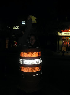
I initially loved the idea of capturing the essence of a performance in a snap shot, but after seeing DeSana's work and recalling all of the laughter brought about by getting stuck in a traffic cone with Mitch one silly college night, I was reminded that a still can never capture the full range of emotions that come with an experience. I'm not sure if that revelation was disenchanting in the sense that it made the exhibition less meaningful to me, or if it just meant that the works in the exhibition were a type of art other than performance, but it certainly made me nostalgic for my good old UofM days for the first time since graduating nearly a year ago...
Thursday, July 29, 2010
Meaningful Conversation
I just finished reading Richard Polsky's book I Sold Andy Warhol (Too Soon). On the whole I found it a bit kfetchy, (winy if you will), and cathartic in the sense that Polsky spends the entirety of the book recounting the history of the rising value of Warhol's Freight Wigs to ultimately make the point that he could have made more money had he been patient and not sold the one he owned so quickly. (A story not unique to the art world, after all everyone has a should have, would have could have story...)
 With exception to the book's great cover, the only other part of the book I found valuable was the following line: "Most paintings are like one-liners; once you get it, that's the end of the experience. The best works of art...reveal something fresh whenever you look at them (p.237)."
On that note, Mitch and I have begun what I'm calling "virtual collections." This means we've created photo albums on Facebook that contain images of works of art that speak to us in some way - images we are happy to look at again and again because of their aesthetic, symbolic, or narrative qualities. We're hoping this idea will be contagious and that many people will start creating virtual collections...
My father pointed out virutal collections are a form of "disruptive innovation." Disruptive innovation is Clayton Christensen's theory that innovations disrupt existing markets by creating products or services that are more accessible, and though they are often less powerful they are still good enough to get the job done. So, while virutal collections may not be as moving or inspirational as seeing the real works in say a museum, for most people they might be good to get the job done, good enough to encourage them to think about art!
Perhaps the best part of virtual collections are that they can provoke conversations that start with, "Hey, I saw that new piece you posted... What do you like about that piece? What's that piece about?" As apposed to, "Saw you hit up another party last week..."
After all, there's nothing better than meaningful conversation - supposedly it's the key to happiness!
Wednesday, June 30, 2010
Discoveries

Okay, so Eilidh Crumlish is not really my discovery - I actually happened upon her on Eyestorm, but her art is awesome, right? (For those of you who don't know Eyestorm, you should check it out; it's a cool website that makes the purchasing of art accessible by showcasing up and coming artists whose works are [for the most part] not outlandishly priced.)
I'm drawn to the colors Crumlish uses, the layouts she chooses, and her off the beat style that lies somewhere between Impressionism, Pop Art, Colorfield Abstract Expressionism, and Arts & Crafts... More specifically, she paints outdoors in Italy and Scotland, often creating large planes of solid, sometimes in-your-face colors, using plywood as her canvas, and occasionally inserting kitschy patterns.
While I could do without the wallpaper-esque patterns in some of her works, (which you can see on her website, as I'd rather not copy them into this post,) I do like the natural swirly pattern that's a product of the plywood she paints and prints on. In fact, I emailed her to see if she ever shows in NYC because I want to see what the unique wooden texture does to the feeling of the work; unfortunately, I never heard back from her so I guess I'll just have to imagine for myself, unless any of you know where I can see her work...
Having recently determined to begin purchasing original works of art, (part of the reason I want to see Crumlish's work first hand,) I have been showing Crumlish's work to friends, fellow gallery girls, and family... Here are some reactions:
"Like Rothko." (Certainly true in the case of the above work, though Crumlish's work is obviously less abstract.)
"Like Michael Craig-Martin." (Subject matter is entirely different but I do see the similarities in Craig-Martin's colors and the colors Cumlish used in the work below...)
Thoughts?

Thursday, June 17, 2010
Art Fun
Zach just reminded me of this interactive Pollock site via an email including nothing more than the link and the phrase "hehe," which I feel describes the fun, kitchy, silly site perfectly. I love the site because it engages people, art lovers and not, in an art related activity, however, this means of creating a Pollock defies the most major innovation that Pollock made to painting: the use of the entire body to paint! To see what I mean, and to counter balance the ridiculousness of the site above, watch the video below that captures Pollock hard at work...
Friday, May 21, 2010
Perfect Imperfections

I found this photograph on deviantART.com, it is by an artist named Siols. To see more of her work, check out her website. In case you can't read it, the quote on the model's legs says "I am far from perfect but I will be perfect for that imperfect someone who is perfect for me."
Monday, April 26, 2010
A Step in the Right Direction
Nowadays, with the availability of cheap and frequent flights, all types of people have the opportunity to travel. And of course, with the all too common, excessively long delays and unavoidable layovers, travelers spend more time in airports than ever. The San Francisco art community has capitalized on these fortunes and misfortunes, by bringing art to the airport - art to the masses. The San Francisco International Airport is the first airport to be accredited by the American Association of Museums, housing exhibitions loaned from other institutions as well as exhibits planned specifically for the airport. Statistics show that some 10% of people passing through the airport actually stop to take a look at the works on display, which are changed and rotated on a regular basis so as not to bore frequent flyers. In a given year well over 350,000 people take note of the eclectic art displayed in the airport! That means that each year there are 300,000 more art viewers at the airport than at the average museum!*
* To read more about SFO museum project, check out an article called "Flying Through San Francisco? Stop to Enjoy the Art," on the NPR website.
Subscribe to:
Comments (Atom)