Friday, May 7, 2010

Arcade Games


Went to Dia Beacon yesterday - hands down the best museum experience of my life. Loved everything about it from the train journey upstate along the water, to the industrial space with old yet perfectly smooth wood floors, to the warm and heavenly atmosphere created by the oversized windows and skylights that let in light which reflects off the pure white walls, to, most importantly, the astounding collection of modern and contemporary art, both conceptually and aesthetically oriented.

Extensive Dia post in the works, but in the meantime I couldn't help but post the picture above, which reminds me of the arcade game called Wacky Gator (right), where you bop the alligator so as to prevent it from exiting its cove. Not sure if that analogy is apt or not, but it kept Seth and I laughing for several minutes... I mean, you do have to look very carefully to tell the difference between the cubes, just as you'd have to watch the alligator coves careful to ensure no getaways; nah, I'm overanalyzing - the culprit's probably just the eerie box with the lid that looks like it's floating...

2. Photo of Wacky Gator too, probably from the 80's.

Someone Great

Sharon probably hasn't seen my last post yet, so before she does I thought I'd post this video to make amends. It's the music video for a song by LCD Soundsystem called "Someone Great." Sharon, Yael, and I went to the filming of the video with Seth in Brooklyn several years ago - I think the whole video is pretty radical, but if you are pressed for time fast forward to 2:46...

There you have it, a whole three seconds of just Sharon's stunning eyes. See, I wasn't lying in my last post when I said Sharon is beautiful. And you can be rest assured her beauty extends far deeper than the physical.

Art History Jokes

I apologize in advance to the victims...

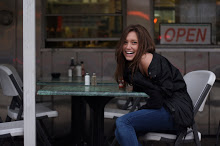
Edgar Degas, Cafe Concert Singer, 1878. Pastel on canvas. The Fogg Art Museum, Harvard University, Cambridge, Massachusettes AND my beautiful best friend Sharon at the Meatpacking District's Brass Monkey, late last Saturday night.

George Grosz, The Poet Max Herrmann-Neisse, 1927. Oil on canvas. MoMA, New York, New York. AND a very unflattering shot of Victor, Alexander's father, relaxing at Robuchon on Christmas eve of 2008.

Monday, May 3, 2010

PICASSO


This week at the Christie's sale, his 1932 painting Nu au Plateau de Sculpteur (Nude, Green Leaves and Bust) (1932) became the most expensive work ever sold at an auction, selling for a whopping $106.5 million; his Metropolitan Museum retrospective, which includes nearly all of the hundreds of his works owned by the Met, has gotten mixed reviews, though most critics have labeled it nothing more glamorous than a big-name hodgepodge; a California art dealer in her 70's admitted to selling a fake of his work for $2 million and is now likely headed to jail; his current MoMA prints exhibition, which I saw and loved last week with my dear family friend Shifra, is yet another testament to his prolificness; a goon stumbled into one of his works at the Metropolitan, resulting in the
creation of a hole in the canvas and an expensive repair job; oh and Gagosian Gallery in Anthens just closed an exhibition of his linocuts, which is especially cool to me because I intern for Gagosian!

However, in my mind the most wonderful Picasso news of 2010, at least so far as New York City is concerned, is brought to you by sidewalk artist Hani Shihada. In four words: Shihada makes art accessible. Chalk as his medium and NYC pavement as his canvas, Shihada both replicates famous works of art and creates his own masterpieces.

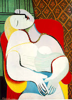
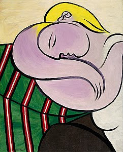
Most recently he recreated Picasso's Le Reve (The Dream) (1932) outside of the Carlyle Hotel, just blocks from the Met, to draw (haha) attention to the opening of their Picasso show. Pardon the momentary tangent, but in light of the fact that The Dream is from the same period as Nude, Green Leaves and Bust (the work from the Christie's auction,) and Woman with Yellow Hair (1931), which I saw on display at the Solomon R. Guggenheim Museum just a few days ago, it strikes me as important to share with you that all three of these works are portraits of Marie-Therese, a teenager with whom a married, middle-aged Picasso had an affair. Picasso was known to have been intoxicated by his love for the young woman and thus his works in which she is the subject are highly erotic; in fact, they are often considered the most sexually charged of Picasso's works. (For example, you might notice that in The Dream the upper half of Marie-Therese's head looks like a phallus.)

So, back to Shihada for a moment: In a recent Daily News article they quoted him saying "This [the sidewalk] is my gallery, the way I like to reach people... It goes straight to the people."

I love that quote because it articulates one of Shihada's goals, which is to reclaim the word "gallery." He shows that galleries don't have to be daunting, exclusive, expensive places, rather galleries can be places that open art to the public, or in Shihada's words, places where art is brought straight to the people.

But Shihada does more than open art to the public in the visual sense, he also makes his viewers think seriously about art's place in society. He invites us to reflect on the artist's process by allowing masses of people to gather around him as he works in a public space, an unusual opportunity given that most artists create in a studio, behind closed doors. In making his process public, Shihada gives us a moment to appreciate the intensity of an artist's labor and the devotion that it takes to be an artist, to produce art. Similarly, as people pass by his work, they naturally ask themselves 'should I walk on the creation, the art, or is that sacrilegious? Why is it that it feels wrong to walk upon it?' Etc.

And even if people aren't intellectualizing Shihada's work as I just have, at least they are exposed to art, they are given the opportunity, free of charge, to visually place a painting with some big name artist they might have only previously heard of, something art historians pay thousands of dollars of tuition to do...

1. Pablo Picasso, Nude, Green Leaves and Bust, 1932. Oil on Canvas. Private Collection.
2. Pablo Picasso, The Dream, 1932. Oil on Canvas. Private Collection.
3. Pablo Picasso, Woman with Yellow Hair, 1931. Oil on Canvas. Solomon R. Guggenheim Foundation, New York, New York.

Horse Races

My friend Andrew Kurland just asked me what I thought of the painting above, which is by artist J. Siegan, a friend of Andrew's father. My own personal aesthetic aside, I noted the interesting juxtaposition between the Asian inspired feeling of the work, with its quick and minimal black brushstrokes, and the very western subject matter.

After my comment, Andrew paused for a second and then asked, "What's western about it?"

"It's a dude on a skateboard, what could be more western than that?" I said.

"That's interesting," he said, "because I see a guy in a full lotus position, meditating, crying."

I see what Andrew's saying, but I'm not convinced given that Siegan is influenced by both the Zen school and the city of Chicago. However, Siegan also cites Robert Motherwell as an influence, and while I certainly don't see that in the painting above, I do see it in the painting to the left, which I, unlike Andrew, much prefer...

And there you have it - that's what makes horse races...

Or perhaps more appropriately, given the theme of this blog - nothing better than space for interpretation and individual opinion...
____
_____
1. Jerry Siegan, #60.
2. Jerry Siegan, Yearning for the Past.

Wednesday, April 28, 2010

Beauty

I can't pinpoint what it is about this photograph that is so captivating to me, but I've been sitting with it here on my desktop for over a week now, so I thought that with or without anything to say about it, it's worth sharing.

I found it while scanning the MoMA website. It's by American artist Lee Friedlander, who's known for photographing musicians, working poor, and sexual/erotic but none-glorified nudes.

This woman has a beautiful body. Not a perfect body, but a real body. A body that appears to have been taken care of lovingly - she hasn't under eaten, or over indulged, she hasn't been ravaged by painful beauty trends, but she also hasn't disregarded any aesthetic sensibility.

This photo is like the artsy version of the "Dove Campaign for Real Beauty." For those of you who don't know / remember, in 2004 Dove launched a campaign shot by Rankin, who I'll dub 'photographer of regular people,' intended to broaden the stereotypes of beauty by featuring regular women, (as apposed to professional models,) of various shapes, sizes, colors, and ages. The women in the advertisements were not thin, but they were also not unhealthily overweight. They were just regular women, doing what they could to feel good about themselves in a culture that is overly focused on body image. Simultaneously, Dove founded the "Self-Esteem Fund," which has positively effected millions of women and girls, through the programming and funding of self-esteem building workshops, which you can learn more about on their website.

Unrelated in terms of subject matter, but related by artist and medium, the photograph below is a more recently shot Friedlander work that has captured my mind.

I've always loved trees because in Jewish culture, and for that matter in many cultures, they symbolize life, hence the Tree of Life. Trees have this amazing capacity to be reborn each year, to start fresh each spring, proving their commitment to life; they become stronger and more beautiful despite having just endured another painful winter, another painful moment. They sprout branches and buds filled with fresh flowers and foliage, as if giving birth to new life which then floods the earth with a colorful petal and leaf shower, just as people conceive of ideas and send them into the world, creating and inspiring.

Incase the mere elegance of Friedlander's tree in not enough, he also captures the shadows it creates rather magnificently through his wide-angle lens, thus producing the illusion that the ground is not just grass covered soil, but rather the earth – round, full, and boundless.

While I was in Venice, I read Toni Morrison's Beloved, a painful story of a broken family doing the best they could despite the relentless hardships of slavery and the supposed freedom that should, but doesn't, come with being an emancipated slave. I highly recommend the book, if not simply for the heartbreaking, provocative story, also because Morrison is one of the most eloquent writers I have ever read – there’s something about her use of metaphors, creative and poetic metaphors… I brought that up because at one point in the novel she describes the shadows of the family holding hands. This idea, or metaphor, continues to captivate me because it expresses the notion that even when things aren’t perfect in reality, or they aren’t perfect right now, beauty, happiness can still be found – a piece of wisdom everyone can appreciate.

Morrison’s insight on shadows led me to do some research on the mysterious silhouettes. I found that in Jungian psychology, the shadow is a part of the mind filled with weaknesses and shortcomings, the types that we repress. Ugh, have shadows become my latest fascination as unconscious suggestion that I need to be doing a better job self-reflecting, self-critiquing? Do I need to become more self-aware? I don’t know if I can handle that!

So, Jungian shadow theories aside for now, here are a few of my own thoughts on the subject of shadows: perhaps they speak to a longing for insights about the past and the future as they fall behind us and then run ahead again; perhaps they remind us to seek meaning in that which is not perfectly clear, to accept that an outline is a good start; perhaps they serve as a metaphor for the connections between light and dark moments; or perhaps they are nothing more than a beautiful subject for a photograph.


  1. Lee Friedlander, Nude, 1980. Gelatin silver print. MoMA, New York.
  2. Lee Friedlander, Tarrytown, New York, 1992. Gelatin silver print. MoMA, New York.

Monday, April 26, 2010

A Step in the Right Direction

Nowadays, with the availability of cheap and frequent flights, all types of people have the opportunity to travel. And of course, with the all too common, excessively long delays and unavoidable layovers, travelers spend more time in airports than ever. The San Francisco art community has capitalized on these fortunes and misfortunes, by bringing art to the airport - art to the masses. The San Francisco International Airport is the first airport to be accredited by the American Association of Museums, housing exhibitions loaned from other institutions as well as exhibits planned specifically for the airport. Statistics show that some 10% of people passing through the airport actually stop to take a look at the works on display, which are changed and rotated on a regular basis so as not to bore frequent flyers. In a given year well over 350,000 people take note of the eclectic art displayed in the airport! That means that each year there are 300,000 more art viewers at the airport than at the average museum!*

For those of you who don't know, my life goal is to make art available and accessible, physically, psychologically, and intellectually, to people from all backgrounds. Thus, in my mind there is nothing greater than public art that engages people, capturing their attention by provoking thought and raising questions, in the way the art at the San Francisco airport does.

The existence of programs like the S.F. airport-museum program is particularly important at this period given that traditional museums, much like churches, synagogues, and temples, no longer work for most people. More explicitly, the main goal of such institutions has always been to add meaning to people's lives, however I speculate that for most they no longer do so for two main reasons: 1) People have found other outlets to stimulate them and produce meaning in their lives, even if those outlets are sometimes bunk, i.e.: television. 2) People want instant gratification; in a fast paced society, people don't have time to visit an institution that only has one function, nor do they have the attention span necessary to do the research that makes the tool, be it prayer or art, function.

Given these pending problems, here are a few key questions we must address in order to fulfill people's needs as we enter this new stage in human development: how do we produce bite-size (not in the physical sense) art that isn't dumbed down? In other words, how do we make art accessible to people, including people with no art historical knowledge, without sugar coating it or diminishing its multitude of dimensions? How do we provide people with the opportunity, and perhaps even encourage people, to engage with art on a regular basis and how do we make such art understandable? What is the best forum through which to do this?

Off the top of my head I can think of several important artists who have used public art to engaged large numbers of people, making them conscious, aware of their daily routines / existences and asking them important question about society at large.
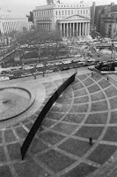
Take Richard Serra and his Tilted Arc (1981), which was commissioned by the U.S.'s General Services Administration Arts-in-Architecture program. Titled Arc was designed by Sera in 1981 and placed outside of Federal Plaza that year. The work called attention to the space in which it laid, a place that thousands of people passed through daily, without ever thinking about or noticing - in other words, regular passersby took the space fore granted.

However, once the piece was put in place, people finally began to notice the space it occupied! In fact, it caused such a ruckus that after a long and heated public debate Titled Arc was taken down because it was so disruptive! Some people feared that it was a terrorist threat because bombs directed at the federal building could be thrown over it; it prohibited others from taking public transport at night because they worried about the invisibility of people on the other side who could potentially mug, or harm them. It caused people to question their notions of security, of familiarity, and it forced people to live with a greater sense of awareness, to live more conscientiously, more alertly. Additionally, it became a target for urination, which brought up questions about homelessness, about poverty, and how on both governmental and grassroots level poverty related issues must be dealt with. And of course, the fact that this mammoth, shield-like work that was ultimately disruptive and upsetting, was installed in Federal Plaza, undoubtedly calls attention to the role of the government as both protective and at times oppressive.

In one concise sentence, Tilted Arc, changed the entire environment of Federal Plaza, forcing people, both consciously and unconsciously, to question and make meaning of societal issues they had once overlooking and parts of their lives that had simply become routine.

I don't know if you'd consider this attempt at capturing people's minds, guiding people to think about meaningful and important aspects of life and society, successful given that Tilted Arc's presence in the public sphere elicited frustration, annoyance, and even anger, but at least it made big a enough stink to bring art into the public sphere!


1. Richard Serra, Tilted Arc, 1981. Steel. Federal Plaza, NYC. Dismantled in 1989.

* To read more about SFO museum project, check out an article called "Flying Through San Francisco? Stop to Enjoy the Art," on the NPR website.