Saturday, March 20, 2010

Paris

As you know from the post about my Louvre experience, I visited Paris last week! Oh how I absolutely love Paris! (Mom, I imagine that statement being read in Eloise’s tone of voice.) The weather was perfect, art was available in full glory, and my hostess, Miriam Dreiblatt, my sister’s best friend, was wonderfully hospitable! With that said, I spent very little time outdoors, and even less time in Miriam’s apartment, because I visited museums for the entire duration of their open hours, from the moment I arrived until the moment I left! (Yes, I went directly from the airport to the Louvre on Monday and directly from the Pompidou to the airport on Wednesday. No, I didn’t even do any shopping, at all, didn’t even go into a single store!)

As I mentioned, first stop was the Louvre, which was overwhelming in a wonderful way, of course. I gave you a pretty thorough idea of my Louvre experience in my previous post, however there is one other notable event that I’d like to share. Because it’s protocol, I of course went to see the infamously mobbed Mona Lisa. Despite the buzz that she projected, which was most likely just the bustle of of masses of tourists whispering and taking pictures, she, like the Vitruvian Man who I saw at the Accademia in Venice in January, could not sing nor dance, which was slightly disappointing. However, this is not a sad story because while what seemed to be the rest of the world was busy snapping away at Mona Lisa’s missing eyebrows, I found Ingres’ The Grand Odalisque, (the painting on which the Gorilla Girls' ad is based,) in a room with David’s Intervention of the Sabine Women and his Oath of the Horatii, which were situated across from Girodet’s The Rest of Endymion, not far from Gericault’s Raft of the Medusa, Delacroix’s Liberty Leading the People, Gros’ The Pest House of Jaffa, and multiple portraits of Napoleon rendered by Gericault, just to name drop a few. (By the way, if any of those paintings don’t ring a bell, I urge you to Wiki them immediately, or email me for a personal 18th/19th century European art history lesson. While, I may be a bigger fan of modern and contemporary art, and while I certainly spent more time looking at Soulages' work than all of the rest of the works I listed put together, the art historian in me couldn’t help but be outrageously excited to see so many of the western cannon’s most famous, influential works all at once!

From the Louvre I walked through the gardens of the Tuileries, where I stopped beside the Henry Moore sculpture in the photo above, to enjoy the warm, fresh air, (a forshpeis, as they say in Yiddish, for the many public art works that I am looking forward to seeing in NYC this spring,) and then ended my day at the Musee de l'Orangerie, a spectacular museum with unusually large amounts of natural light, and perfect artificial lighting as well. (Lighting plays a crucial role in how I experience all spaces, from galleries to bathrooms. Sometimes I wish we could light up the world solely with candles, millions of them, because candle light surely produces the best atmosphere, or vibes if you will.)
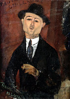
Unfortunately, several of the Musee de l'Orangerie's galleries were closed for reinstallation, but I got to see Monet's water lilies and had that been it, dyanu, because the deep purples and oranges, which I've never before seen in other versions of the lilies, were breathtakingly beautiful. (As you can see, I am getting ready for Passover, where we sing a song called Dyanu, which essentially means "would have been enough".) BUT, the water lilies are not all that I saw! I also saw Paul Guillaume's collection, which is housed by the museum. Paul Giullaume was an early 20th century collector who amassed an extraordinary modern art collection during his forty year life. The collection now includes works by Renoir, Monet, Cezanne, Rousseau, Matisse, Picasso, and Modigliani, just to name a few. My favorite work was Modigliani's Paul Guillaume, Novo Pilota (1915), because it reminds me of home since a reproduction of it hangs on Alexander's wall, as it is one of his favorites. Plus, beside the portrait of Guillaume, there was a Modigliani portrait called Antonia (1915), and she looked a bit like me, so I felt as though Alexander and I were temporarily reunited. (Oops, sorry for going cheeseball on you for a second there.)

After the Musee de l'Orangerie, I met Miriam at a super cool Parisian cafe-bar, and then we headed back to her house to have dinner with her host family, which was a treat, as all too often vacations become filled with touristy activities like visits to the Louvre, and meeting the residents, who give life to the culture, gets overlooked.

The next day I woke up bright and early and visited five museums! First stop: Musee D'Orsay. I arbitrarily decided to go on a guided tour of the highlights of the impressionist collection, which was a positive experience on a couple levels. 1) I met two lovely guys from Singapore, (who in what seems to be typical fashion at this point, asked to take a picture with me). 2) I learned about the history of the building that houses the collection: it was a former railroad station... 3) I found that I knew just about everything that the docent shared with us in her two hour tour, which was super exciting because it is really a testament to how much I learned in the two impressionism classes I took during my college career. 4) Afterward, when I walked around the museum on my own, I was able to contemplate the art historical narrative created by the docent, admiring certain aspects of her tour and critiquing others. I imagined which pieces I would have added or subtracted from the tour had I been the docent, and ultimately I came up with my own narrative on the story of impressionism, which I would in fact like to share with you however, for the sake of holding you attention I will do so another time...

Off to the Rodin Museum! We're all familiar with Rodin's most famous work, The Thinker (1902), but thanks to my visit to the Rodin Museum, I've seen every possible permutation of the work. The Thinker was originally meant to depict Dante in front of the Gates of Hell, from his "The Inferno." The number one thing the work is intended to represent is the importance of intellect, however from a quick glimpse at the work it seems to be more representative of the pain caused by intellect - you know, a visual representation of the opposite of "stupidity is bliss." Regardless, The Thinker is surely not up there on the list of the darkest of Rodin's works - for something extremely disturbing Google The Cry (c. late 19th century). The collection is housed in a old, almost decaying, mansion that has a musty smell and feels like a brightly lit haunted house spooked by Rodin's beautifully rendered, contorted, disturbed, and disturbing figures. The whole scene was inspiring and I actually sat and sketched for over an hour and then wondered the gardens for another hour and took photos, (on an archaic disposable camera, since my digital ran out of battery on the first day). (Oh and Ramon, if you are out there reading this, I found a very special bronze Gaunyin from China, she was seated with a child on her knees - when I have my pictures developed I will send a photo of her to you.)

The next museum I visited was Musee du Quai Branly, which is absolutely one of the weirdest museums in that it looks like a combination between a jungle and a kids museums, which ironically are the two stereotypes about "primitive," or indigenous, art and cultures that the museum tries to fight. The spiral structure of the museum is reminiscent of the Guggenheim in NYC, except instead of the empty space in the center there is an exposed bunker that houses all of the works which aren't formally on display. The outside of the building is quite interesting, as it is a "living wall" that was designed and planted by Gilles Clément and Patrick Blanc. (When I get my disposable camera back I will upload a photo of this...) I enjoyed viewing the art, particularly because I studied African art for two semesters in college, but I think I'm a little jaded because I can see similar art objects at Alexander's house whenever I want since his father collects art of pre-modern cultures. (Visit his family's collection website at: www.tomkinscollection.org) However, one installation called The River (2010) by Charles Sandison is worthy of mention. The River is a video projection on the path through the museum, containing an assortment of words whose connections I could not determine. Sandison is a post-minimalist, conceptual artist whose works always incorporate words - as he says, "Words are very important, they seem to have a life and history... I precieve them as living entities." I personally enjoyed watching people interact with the projected words as they wooshed accross the floor in an unfamiliar way. Some people didn't want to step on the words at all as if it was sacreligous to do so, others deliberately stepped on particular words... Feel free to watch this YouTube clip to get the feeling:

Following the Musee du Quai Branly, I walked beneath the Eiffel Tower to the Art Moderne de la Ville de Paris. (Unfortunately I couldn't go to the top because the wait was over an hour, however I did take a photograph of a person standing on a ridiculous Eiffel Tower veiw-simulator billboard thing, which again, I will post when I get my disposable camera developed. As you can imagine, that was a very funny sight.) Sadly a large part of their perminant collection was closed for rennovations, however I had the honor of seeing ceramics created by Matisse and the other fauvists, who I didn't even know produced ceramics! My favorite part of the museum was a corner made up of two pure white walls, covered in a Malevich collage - the instillation is called The Last Futurist Exhibtion, (1985). My articulation will not do justice to the instillation, and Google failed to come up with a colored photograph, so you'll just have to wait patiently until I develop my pictures to catch a glimpse of the awesome scene. (Ugh, what did you people do before the age of digital photography, with its instant gratification properties?)

At the Art Moderne de la Ville de Paris, I took the time to watch short video art films, (I don't think that's what they called,) which is something I never do, largely because of my ignorance regarding this medium. However, I was inspired to watch the videos during this particular museum visit because they were set up in a cool, accessible way: they had several videos playing in different parts of one huge, dark room, and surrounding each television were comfortable chairs to rest on, (a huge draw after all of the walking I'd done,) and smaller screens showing interviews with the artists for the purpose of shedding insight on the works. I saw two impactful (is that a word?) videos, both of which were so disturbing that I could not stand to watch any others. The first was Paul McCarthy's Wild Gone Girls (2003), an extremely graphic scene of girls slashing and delapitating each other during a sailing party gone terribly wrong. The editing of the work is meant to mimic the dicy editing of a Girls Gone Wild film, and the narrative is supposed to make you consider the effects that violence and mutilation, both real and simulated, have on the viewer. (To watch the video, visit this link: www.dangerousminds.net/index.php/site/tag/Paul-McCarthy/ ) The second video I watched was El Gringo by Francis Alys (2003). In this video, Alys essentially disappears, as the camera becomes the protagonist, serving as both a shield and a weapon against a group of wild dogs that attack him upon provokation. The intersting part of this video is that he deos something that simply could not be done using any other medium - as he says, the camera offers him a "filter," "justification," "sense of protection" in the heat of the dangerous situation. (To watch the video, visit this link: www.lumeneclipse.com/gallery/04/alys/index.html )

I probably could have stayed at the Art Moderne de la Ville de Paris for another several hours - I just loved the way the light shined through the giant windows, illuminating the front rooms and providing a view of the building's age old facade filled with skateboarders and graffiti, (an interplay that I'd consider to be art, in and of itself) - but unfortunately the museum was closing and I therefore was unable to visit the temporary exhibitions.

For what it's worth, the Palais d'Tokyo is just accross the street from the Art Moderne de la Ville de Paris, and it is open until midnight... So, I headed over there to find nothing more than a monsterously industrial, terribly uninviting warehouse of a space, containing nothing interesting. In fact, I'd argue that even the most massive works or art, like the beloved Richard Serra's, aren't large enough to fill the space in any meaningful way.

Finally through with my full day of museum visits, I met up with Miriam for falafel in Le Marais, a delicious treat I'd been waiting for since the moment I booked my flight to Paris. After scarfing down the best shwarma of my life, Miriam and I wondered the streets until we stumbled upon an olive oil tasting, which we decided to partake in. The whole thing was in French, but Miriam kindly translated for me, providing me with what I imagine was a bit of her own sarcastic and humerous take on what the very serious Frenchman was saying as he discussed olive oil, and perhaps pitched his products, for nearly two hours.

That brings me to Wednesday. So tired from my jam-packed museum day, I actually permitted myself to sleep in, (and by that I mean I slept until about 9:30,) something I haven't done since arriving in Europe. When I woke up, Miriam and I walked to a hair salon where I got my hair cut, very short! I'm still abivilent about my haircut and as I told Alexander last night, "I will not set foot in another hair salon for the rest of my life." Well, maybe that's extreme, but seriously I've never actually loved any haircut I've ever gotten! Hm, maybe it's just that I don't like change all together... Anyway, here is a picture - you can decide for youselves if my new do works in my favor or not. (Please don't share your opinion in the comment section of my blog.)
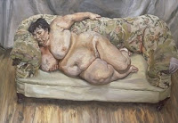
After my haircut I ventured to the Pompidou. The first exhibition I saw at the Pompidou was the Lucian Freud (grandson of Sigmund Freud) retrospective. Freud's works are mostly portraits of wrinkly, saggy, and fat people, and not particularly picturesque views from his studio windows. Needless to say, I didn't like the works very much, but I did think what Freud had to say on the subject was interesting: "...I wish my portraits to be of the people, not like them. Not having a look of the sitter, being them. I didn't want to get just a... mimic, but to portray them, like an actor. As far as I'm concerned the paint is the person. I want it to work for me as flesh does."

Next I saw the feature exhibition called Elles@CentrePompidou: Women Artists in the Collections of the National Modern Art Museum. The exhibition was broken up into seven sections: Pioneer, Free Fire, Body Slogan, The Activist Body, A Room of One's Own, Wordworks, and Immaterials. (To learn more about each specific section visit this link: centrepompidou.fr/Pompidou/Manifs.nsf/0/44638F832F0AFABFC12575290030CF0D?OpenDocument&sessionM=2.2.1&L=2 .) Interestingly, there was not one single piece in the entire exhibition that was asthetically beautiful. The works were all either conceptual or graphically violent, sexual, or just downright disturbing. While I think it's admirable that such a large, world-renouned cultural institution has devoted almost all of their gallery space to presenting the work of women artists, I read a great quote by artist Judy Chicago in December's issue of ARTnews, that articulates the problematics of this exhibition perfectly: "...[women artists] are still fit into a meta-male narrative. One of our goals is to integrate women's history into the mainstream, so it is no longer a separate, minor phenomenon. There is still an institutional lag and an insistence on a male Eurocentric narrative. We are trying to change the future: to get girls and boys to realize that women's art is not an exception - it's a normal part of history." And by creating an exhibition fully devoted to feminist art, as apposed to merely featuring women's art within the galleries that house the perminent collection, we are yet again setting women apart from mainstream history.

After the Pompidou I visited Brancusi's studio, as reinvented by Renzo Piano. Not much to say about that experience, as I really rushed through it in an effort to make it to the airport on time for my flight. So, after breathing my last breath of big city air, I hopped onto the metro, to get to the bus, which took me to the plane, that took me to a second bus, which left me to take the vaperetto back to my house where Max Teicher, who had come all the way from Berlin, was awaiting my arrival, just in time to close one adventure's book, and open another...

1. Me in front of the Louvre.

2. Henry Moore, Reclining Figure, 1951. Garden of the Tuileries, Paris.

3. Amedeo Modigliani,
Paul Guillaume, Novo Pilota, 1915.
 Oil on cardboard mounted on cradled plywood. Musée de l'Orangerie, Paris.

4. Me with my new friends from Singapore in front of the Musee D’Orsay. (Pending)

5. Me in front of The Thinker in the garden of the Rodin Museum. (Pending)

6. Me in the reflection of Musee du quai Branly’s “living wall.” (Pending)

7. Man on Eiffel tower view simulator thing – LOL. (Pending)

8. Kazimer Malevich, Last futurist Exhibition, 1915. (Pending)

9. My new haircut.

10. Lucian Freud, Benefits Supervisor Sleeping, 1995. Oil on Canvas. Private Collection. (In 2008, this painting set a new world record price for a work by a living artist, selling at a Christie’s auction for over 33 million dollars.)

Women Artists

Guerrilla Girls, Do Women Have to be Naked to Get into the Met?, 1989. Advertisement on NYC buses.

Feminism: a concept that's on my mind for a number of reasons: 1) On Wednesday I am giving my final PGC seminar on the topic of instillation art produced during the three waves of feminism. 2) The Pompidou, which I just visited is having a major exhibition on feminist art. 3) The feature article in December's issue of ARTnews is titled "The Feminist Evolution." 4) I'm working for the PGC, and while I wouldn't call Peggy a feminist, Peggy was a strong, independent, charismatic, opinionated woman, who has had a lasting impact on art history. (Although people often attribute the success of her collection to Marcel Duchamp, her art advisor and friend, because somehow despite feminists' efforts, women just can't seem to gain credit, even when and where credit is due.) 4) My new favorite artist in the Peggy Guggenheim Collection is Pegeen Vail, one of only approximately three female artists represented by the collection.

While we are on the subject of Pegeen, I'd like to share an anecdote: In a recent staff talk with Dr. Rylands, director of the PGC, one of my fellow interns asked how many works are owned by the collection. Dr. Rylands hesitated for a moment and then said , "about 350, but the precise number is debatable... It's dependent on whether we count photos, etc, and Pegeen's works." A groan passed through the room, as everyone lamented the fact that Pegeen's arts and crafts projects occupy an entire, though small, PGC gallery space.

Maybe I'm on a feminist rampage right now, but honestly is pisses me off that there is even a question regarding the legitimacy of Pegeen's work, (a frustration that is compounded by the fact that images of Pegeen's works aren't even available on the Guggenheim or PGC websites, though the rest of the collections are easily accessible.) Peggy exhibited Pegeen's work in both of her galleries, Peggy bequeathed Pegeen's work to the Solomon R. Guggenheim foundation along with the rest of her collection, as far as I know Pegeen had no other job besides painting, and honestly no one has any good response when I ask why Pegeen's art is not considered art. You know what that means? It means her work is not considered art because she's a woman, and as the Gorilla Girls point out in the poster above: women are not artists, women are just the subjects of art.

In an effort to fight the stigma against women artists, I would like to tell you a little bit about artist Pegeen Vail. Pegeen was one of Peggy Guggenheim's two children, and her only daughter. Born in Switzerland in 1926 to Peggy Guggenheim and Lawrence Vail, and raised in Paris and London by Peggy alone, Pegeen had a tumultuous childhood. Pegeen was artistic from a young age, and her talent was fostered by Peggy, who showed Pegeen's works at her galleries in London at the Guggenheim Jeune, when Pegeen was a child, and in Art of This Century in New York City, when Pegeen was a young women. Like her mother, Pegeen had a number of dysfunctional relationships, which combined with her unstable childhood lead down a path of substance abuse, which undoubtedly lead to her premature death in 1967, just as she was beginning to gain fame in the art world.

As for her art, even if Dr. Rylands and the rest of the PGC intern crew see Pegeen's works as amateur art, I find them beautiful and fascinating. The colors alone remind me of those of the fauvists, bright and symbolic. The figures are soft and wiggly, for lack of a better word, they seem to dance around the canvas as the bask in the sunlight of Peggy's former bathroom, where Pegeen's works are now kept. Though the faces of the characters seem to lack personality, a careful look proves that the works do in fact have emotional depth and perhaps autobiographical relevance. As Peggy said of the works in her own autobiography Confessions of an Art Addict, "...the people in Pegeen's paintings... never seem to be engaging in any conversation with each other, all going their own way," which is likely how Pegeen felt about all of the people in her own life.

So in an effort to do my part in ensuring that we don't allow anymore female artists slip away from the grip of the cannon, I will do my best to feature more works by women artists on this blog... On that note, do check out the Gorilla Girls' website to learn more statistics about women in the art world, such as the fact that there are now even fewer works by women on display at the Met than there were in 1989, when the poster above was first produced...

Thursday, March 18, 2010

Hidden Treasures


In the depths of the Louvre, besides the great masterworks of Medieval and Renaissance Italian artists, I came upon a modern gem. The piece’s contrasting tones are stark and reminiscent of Malevich’s Black Square (1915) dressed up for Halloween, and the work clashes terrible with the beige walls on which it has been implanted. Regardless, the very fact that this ultra contemporary delight has been thrown into the mix of Madonnas and child, robed men, and mythical scenarios, all adorned in ostentatious gold frames, (ha, maybe they’re actually the ones on their way to the Halloween party,) makes the work standout. Perhaps in the same way the less than mediocre babaganoush I had when I first arrived in Paris was one of he best things I’ve tasted in the past 2.5 months, given every other morsel I’ve put in my mouth has been Italian.The work is by Pierre Soulages, who is supposedly having a retrospective at the Pompidou, which I somehow could not find when I was there, and is called Peinture (2000).

Soulages chose to place this work in the Louvre's Salon Carre because, as he says, the Salon Carre “brings together paintings that represent a significant point in the development of Western painting…” In particular, he situated his piece beside a work he admires, Paolo Uccello’s La Bataille de San Romano (1438), because La Bataille de San Romano refers to an outside narrative, whereas Peinture is about the relationship between the spectator and the painting, and thus the two works are entirely different and there’s no competition between them.

Despite the fact that Soulages claims that the works are entirely different, I can’t help but see a number of connections. Firstly, darkness is a key feature of both works. While sitting in the Louvre, I made a friend named Mathildes who studied Soulages work for her PhD dissertation; she told me that Soulages rarely uses color in his work, because he is interested in the way the light of a space interacts with the darkness of his canvas. Likewise, La Bastalle de San Romano has a dark tone. Unfortunately I cannot seem to find any information on whether this is in fact a night scene, however the work depicts a battle between Florence and Siena that occurred in the 1400’s. In both cases, the darkness of the backgrounds is emphasized by the presence of pigments with reflective qualities: gold in Uccello’s work, and white in Soulages’.

The second connection may well be a conspiracy theory born from my unruly mind as it sat before the two works for nearly two hours, or perhaps the influence of too much ARTnews with all of their forensic cases... However, many modern artists abstract familiar forms by reducing them to their most essential features, and call me crazy, but the more I look at Soulages' work the more I see an abstracted version of the very same scene, or perhaps the very next scene, depicted by Uccello. Perhaps Soulages represents Uccello’s knights / soldiers with all of their accoutrements for war through his messy white lines, after all life, and certainly war, are undoubtedly messy. In other words, maybe Uccello’s perfectly clear warriors are headed into the dark, chaos of war represented in Soulages' abstract work. In fact, the flagpoles in Uccello’s work and the horizontal lines of Soulages’ even flow seamlessly into one another, creating a bridge between the two.

Coincidental? Maybe… Interesting nonetheless? I hope…


More to come on my Parisian art escapades soon!


1. Kazamir Malevich, Black Square, 1915, Oil on Canvas. State Russian Museum, St. Petersburg.

2. Pierre Soulages, Peinture, 2000. Musee du Louvre, Paris.

3. Paolo Uccello, The Battle of San Romano, c. 1455, wood panel. Musee du Louvre, Paris.

4. Photograph of Soulages’ and Uccello’s works beside each other in the Salon Carre.

Friday, March 12, 2010

Coming Full Circle

"Good artists borrow, great artists steal." -Pablo Picasso

Today I found this quote, which is quite pertinent given the ongoing originality conversation I've been having through my blog.

I'm almost certain that this quote has been taken out of context, as seems to happen with so many quotes, but if in fact Picasso meant what he said literally, than there is no doubt that he would have loved the 3-d remake of
Guernica, which you can watch below.

The quote comes from a description of an exhibition being held at the Rubell Family Collection in Miami, which I was introduced to by Richie and Amy, and has given me yet another reason to look forward to my upcoming trip there in just 16 days! The Rubell Collection is currently holding an exhibition called "Beg Borrow and Steal," a title that is a real attention grabber, and therefore great in and of itself. The show is based on the premise that, "While the question of artistic influence may not be new, what artists choose to borrow or steal, and from whom, is distinct in that it becomes a reflection of their own time." I'd never thought of reappropriation in such a way, but I do like that idea. (Ironically, or perhaps not, the exhibition was born from a conversation with artist Kelly Walker, who told NYMag back in 2005 that he doesn't like the term appropriation.)

Come to think of it, the idea that compiling borrowed/stolen images creates a "unique" time piece, so to speak, reminds me of an artwork called
Tormented Self-Portrait (Susie at Arles) (1987-8) by Ashley Bickerton. The work is comprised of a metal frame that encapsulates what are essentially advertisements that were paid for by their respective companies. Bickerton saw that surfboarders and racecar drivers, and athletes of all sorts for that matter, were being sponsered and through this work he asks the question, why can’t art(ists) be sponsored too? Bickerton is discussing the colonization of the world (and art) through advertising, and thus begging us to reflect upon how much of our own identities are influenced by consumerism. This may be a "self-portrait," but is there actually a self here?

The curators of "Beg Borrow and Steal" would probably answer yes because these advertisements, or sponsorship logos, reflect the products that Bickerton uses, and thus the things that matter to him. On the other hand, the work is completely emotionless, and arguable also void of any aesthetic sensibility, and aren't those qualities a large part of what it means to be human?

Back to Picasso's quote for one second: who did he ever steal, or even borrow from for that matter? At the top of this post you can see my new favorite painting, Picasso's
Night Fishing at Antibes (1939), (which I believe was at one time owned by Peggy, but is owned by the MoMA - so MoMA, if you're out there please show this piece soon!) This painting was clearly influenced by Matisse, and possibly Cezanne as well, but I certainly would not call this stealing! Hm, looks like we might have ourselves another case of the language barrier...

1. Pablo Picasso, Nightfishing at Antibes, 1939. Oil on canvas. MoMA, New York.
2. Ashley Bickerton,
Tormented Self-Portrait (Susie at Arles), 1987-88. Synthetic polymer paint, bronze powder and lacquer on wood, anodized aluminum, rubber, plastic, formica, leather, chrome-plated steel, and canvas. MoMA, New York.

Tuesday, March 9, 2010

Virtuosity

I recently found the animated version of Picasso's Guernica (1937) posted below, on a blog, alongside the question: “Is Picasso scowling or smiling from his grave?” Cute question, eh? I think Picasso would probably feel two conflicting emotions; after all he was the master of dualities. On the one hand, he'd be proud to know how influential he is. On the other, the flatness of his works is one of the characteristics that made him cutting edge for his time, and this animation completely undoes, or defies that...

Regardless, to me, what Picasso would think is not what really matters here. As Roland Barthes says in his 1967 article, “The Death of the Author,” “To give a text an Author is to impose a limit on that text, to furnish it with a final signified, to close the writing.” While Roland Barthes might take this idea to an extreme, he makes an important point that getting caught up in what the author, or in this case the artist, would think, feel, do, or consider, ultimately stifles the multitude of possible interpretations, which are the only important part of a work, after the author has put down his pen, and the artist his paintbrush.

To me, the following are the real questions raised by the animation: Is our society becoming reliant on sound and motion to make meaning? Are we slowly beginning to disregard original representations, in favor of reinterpretations and reappropriations?

I don’t mean to sound like an anti-technology stalwart, or something, so let me explain myself.

I believe that there is a virtue in being able to see the beauty, the meaning in things that aren’t electronic, aren’t animated, and don’t have bells and whistles that in the end just distract. In a 2009 article written by Dick Meyer for NPR called “Literary Death Spiral? The Fading Book Selection,” he points out that sadly our society’s obsession with “computers, mobile, video games, and everything on demand, all the time,” has created “an aversion to long chunks of sentences.” He goes on to claim that “The dire problem is that long chunks of sentences are still the best way humans have to express complex thoughts, intricate observations, fleeting emotions — the whole range of what we are.” And I fear that the same is true for art. We are so used to things flashing, moving, beeping, buzzing, and capturing all of our senses at the same time that so many of us have lost the ability to be stimulated by simply looking at an “old fashioned” painting on the wall, the purity of which has respectability in its own right.

I have a perfect firsthand example. I cannot count how many people come into the Peggy Guggenheim Collection and look at the text-labels before even looking at the piece of art on the wall. Somehow we can’t appreciate the art without knowing is provenance, perhaps because we don’t trust ourselves, or perhaps because we have a desire to keep up with the “cultural elite,” to be able to post on our Twitter and Facebook accounts “I saw a Dali,” or “I saw a Picasso.”

I wonder if a time will come when all of the great masterworks will be turned into animations. Will that make the works themselves more or less valuable? More or less appreciated? On the one hand, these animations, like the Guernica one below, might make art accessible to people who otherwise don’t have the chance to see the work, and certainly might not understand it, but on the other hand might we forget about the value in using the required brain power to analyze a painting and bring it to life using our own imaginations? Will we instead rely on these animations that come with a song and dance because we’re too lazy to create the song and dance on our own?

I hope I don’t sound too negative here, because honestly my one life goal, the reason I have chosen to make my career in museology and writing about art, is to make art alive, accessible, real, important for all types of people. And so, if this little animated version of Guernica does that, then power to its creator…

Names


Last year I went with one of my best friends Sam Goodman, who has always been a supporter of my passion for art and is a phenomenal artist himself, to his winter formal in Toronto. During our one break from partying I convinced him and some friends to come with me to The Museum of Contemporary Canadian Art (MOCCA), where I fell in love with a piece that is of the Gestural Abstract Expressionist vein.

Quick art history lesson: There are two types of Abstract Expressionism, Colorfield and Gestural. Colorfield Ab-Ex is characterized by the presence of large, flat planes of color – think Mark Rothko. On the other hand, Gestural Ab-Ex is focused on the artist’s movement across the canvas – Pollock being the popular example.

For a long time after our trip, I thought about the beautiful piece that was made up of large gestures in deep reds, burgundies, and oranges on a (creamy) white, almost unfinished background, with bits of contrasting light aqua blue unexpectedly thrown in. However, I couldn’t recall the name of the artist, or the painting for that matter. I kept my eye out for word on the artist in the NYTimes arts section and all of the popular art magazines, to no avail. This morning I took it upon myself to Google every artist listed on MOCCA’s website, and guess what? I didn’t find an image of the exact piece from MOCCA that I loved so very much, but I found the artist!

Ladies and Gentlemen, I am pleased to present Deborah Friedman. *

And Deborah Freedman.

And… Deborah Freedman!

Oh and lastly, Debbie Friedman!

Let me explain. During my search for Deborah Friedman, the Michigan based artist whose work I saw at MOCCA, I found two other awesome artists and was reminded of a used-to-be favorite singer/songwriter, all of whom have the same name, (though different spellings).

The first, a writer and illustrator of children’s books and poems, who uses a super fine point black ink pen and minimal colors to create quirkily detailed, paradoxically sophisticated yet child-like drawings. In 2007, this Deborah wrote a children’s book called Scribble that won a ton of awards. Lack of English book stores here in Venice has prevented me from seeing the entirety of the book, but the sneak peak that can be seen on Deborah’s website (www.deborahfreedman.net), indicates that the book is about children creating art and the coming to life of a scribble – looks adorable. However, she's also made freestanding illustrations of nursery rhymes and hymns, and creations from her own imagination. The one to the right is from her Montage series. Oh and her blog (www.deborahfreedman.wordpress.net) is also great, especially because she features a clip from Alexander and the Terrible, Horrible, No Good, Very Bad Day (1972), my all time favorite kids’ book!

The second, a New York City based artist, who creates richly hued abstract landscapes that seem to have emotional depth emanating from the colors. Though some of her works appear to have white mixed in to lighten colors, and thereby the feeling, a tactic that I am not a fan of because I don’t find pastels aesthetically pleasing, I do like the work to the left called West Shokan (2007). The profile on her website (www.deborahfreedman.com) indicates that she has exhibited works at a large number of big name galleries and museums, though I don’t recall ever seeing her art… But you know how that is, once you learn about someone / something you begin to see it everywhere…

And lastly, good old Debbie Friedman, creator of the all time greatest (Jewish) hit: Mordechai the wonderful, wonderful, Mordechai he’s so handsome and pretty he’s our favorite hero in all of Shushan City… Oh and even better, I am a latka, I’m a latka and I am waiting for Hanukkah to come… Okay, okay those two were favorites of the Kurzweil children, (and I say Kurzweil as apposed to Kula deliberately because while Mom was a fan, Abba was certainly not,) but not Debbie Friedman’s greatest hits by any stretch. Debbie Friedman’s most well known songs are probably her version of Mi Sheberach, a traditional Jewish healing prayer, and Not By Might – Not By Power. I tried to find some good Youtube clips of these songs for you, and though I was so moved by some of her songs that I practically cried, my roommates nearly killed me, which lead me to believe I’d be best off allowing all of you Jews out there to seek her out on Itunes at your own discretion, and all of you non-Jews to just go listen to some Joan Baez instead.

So, there must be something about the name Deborah Friedman / Freedman, that inspires creativity. After all, Freakenomics authors Stephen Dubner and Steven Levitt do have all those sociological, socioeconomic theories about the power of names…


*Check out more of Deborah Friedman’s works on her website, www.deborahfriedman.com. I’m particularly enamored by her series Changes and Windows/Alpha. Perhaps I can convince you to go to her website by telling you that the vividness of the flame colors in the first work from Changes is extraordinary, and the only reason I didn't feature that work is because when I copied it into my blog the colors faded. (And actually the colors of the work I posted are also faded.)

1. Deborah Friedman, Changes. Oil on Wood Panel.
2. Deborah Freedman, Lollis. Pen, Ink, and Watercolor.
3. Deborah Freedman, West Shokan, 2007. Oil on Canvas.

Monday, March 8, 2010

Accessibility

Seth just showed me this music video, which is basically an art historian's dream! We need more people to make art history alive, available to the masses, like this band, Hold Your Horses! does.