Monday, January 3, 2011

Photo Journals!

Recently Arianna Huffinton wrote a piece for the Huffington Post's arts section that largely served to criticize museums' use of the internet as a tool for disseminating art. [Click this link to read her op-ed.] She suggested that when people look at works of art online, versus having the traditional art viewing experience at a museum, they are robbed of the opportunity to understand the art at a level deeper than its aesthetic worth.

While I understand where Huffington is coming from, I think she fails to recognize that while the internet, and social media technologies specifically, can strip art of its depth, (a point well proven by her example of the possibility of pressing a button that says “like” or “dislike” about a piece of art without an explanation or discussion,) the internet's dissemination of images of art does provide people who wouldn’t ordinarily go to museums with the opportunity to see art (and hopefully think about it on their own, even if they don't discuss it publicly). And who knows, perhaps such experiences do in fact draw people into museums, though if nothing else, I would claim that viewing art online is better than not at all.

On a side note, Huffington's point is apt for many industries, (not just art,) media being the most detrimentally affected victim. What I mean is that on the one hand technology is great for the media industry in that it has enabled unprecedented numbers of people to know what's happening in the world - for example many people who might not read the newspaper, still see news headlines on their AOL newsfeed. The down side of this is that there isn’t always “important” news to be disseminated, so the constant news-casting that is a product of the plethora of available technologies, has caused the most mind numbing things to be broadcasted in "dull" moments, for example how much money Bernie Madoff’s underpants sold for at auction.

So, perhaps a way to reconcile both of these matters is to invest in more photo journal type columns. (Yes, yes, you are right there's always an agenda at hand.) For example, from time to time there is a photo journal in the New York Times. Such pieces always catch my eye, perhaps because they are out of the ordinary, but more likely because I, like many people am drawn to visual stimulants. Seeing a big picture in the Times, or many pictures as is the case with a photo journal, sparks my curiosity about the topic at hand. Thus, photo journals are a way to spread art (in a context that necessitates, or at the very least is conducive to, explanation), while also disseminating meaningful news, (at least I hope since it certainly would not be interesting to see photos of each of Bernie Madoff's pairs of panties).

On that note, below is my very own photo journal that documents the view from the balcony of the villa my family stayed in in St. Maarten in late December. Though lacking in any artistic edge or important current world news, it does captures the importance of leisure time, so I hope you will enjoy! (Although, come to think of it, I could go ahead and make a pitch for some environmental cause, since you gotta admit this is downright gorgeous and certainly worth preserving for future generations to witness if nothing else!)

Saturday, December 25, 2010

The Season of Lights (and the art that comes with)

Recently, my friend Linda, from New Zealand, came to New York City for a visit. (She actually came because she's writing her master's thesis on the Peter Greenaway work/show that's currently taking place at the Amory, which I'm dying to see!) Anyway, having not met many Jews before arriving at my house on the Upper West Side, she was interested in how Christmas in NYC makes Jews feel given its unavoidable presence.

I could not and cannot answer this question for all Jews, (though I hope at least most would agree,) but for me, simply put, I love it. In fact, I'm delighted to be able to take part (if even just passively) in a religious tradition that adds meaning to people's lives. (Unless of course it involves extraordinarily loud music at sunrise, as is the case with the Christmas parade here in St. Maarten, which woke me up this morning. With that said, above you can see pictures from the balcony of our villa - despite the lack of snow, the atmosphere does make for a pretty spectacular Christmas feeling, eh?)

Anyway, back in NYC I appreciate the tree vendors who line the streets with spruces that give
the city the smell of a magical winter forest. I am awed by the creativity that goes into the production of the Christmas windows and I enjoy interacting with the many people from a plethora of backgroudns who are drawn out from their homes and onto 5th Avenue to see the elaborate displays no matter the temperature. I am proud to be American during the holiday season because people are so generous (albeit a bit consumer oriented) and grateful to have time to spend with family and friends. And I can't get enough of the lights that decorate all of the city's trees creating a spiritual, perhaps even mystical feeling that inspires strangers to offer each other holidays greetings as they pass on the street. All and all the city and its dwellers and visitors are happy and there is nothing better than that...

Linda understood just what I meant when she and I walked all the way from our dinner Caracas (favorite restaurant!) home. On our way we passed the usual, which I described above, as well as an awesome light installation in Madison Square Park that Seth had taken me to a few weeks earlier.

Prior to holiday time, and in day light as apposed to darkness, I had not thought of the installation as speaking to the season, and my guess is that it isn't intended to. However, seeing the installation in the context of my Christmas walk with Linda, made me realize just how poignant the exhibition is at this time of year, which is so laden with lights both literally and figuratively.

The installation, which is by Jim Campbell, has three components: Scattered Light, which is made up of hundreds of hanging light bulbs that are programmed to light up and dim down in a way that creates an illusion that people (or at least their shadows) are passing through the space that the lights occupy. The Madison Square Park website, which you can access through the link above, explains that the work is supposed to reflect the pedestrian experience in an urban environment. It's a shame that the MSP website doesn't shed more light on the work because that one sentence that describes the conceptual objective of the work seems to indicate that the city is much more lively, or vibrant than the people, though I like to think it's the people who make the city the exciting place that it is!


Regardless, to me the most interesting quality of the work is that depending on the angle from which it's viewed, the shadows, or silhouettes are either completely sharp, or rather abstract. (You can see this quality in the first minute of the video above.) I'm sure I've taken my analysis of this work too far, but to me, that feature serves as a reminder that during the "season of lights" is a time that we make an extra effort to reach out to our family and friends, so as not to allow them to turn into vague, distant characters.

The second part of the work is called Broken Window, but unfortunately both times I visited the installation, this work seemed to stick true to it's name, leaving me little to say about it. (Or is that the point?)

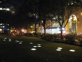
The third piece, Voices in the Subway Station, is made up of a number of glass panels that are situated in the grass and light up sequentially. After a bit of research, I've come to find that there are two interpretations of this work, so by all means take your pick: 1) The order in which the panels light up mimics the effect of a passing subway, as a person above ground would see it through the grated sidewalk out of the corner of his eye. 2) The lights are intended to represent people speaking to one another on a station platform as they wait for the subway to arrive, thus creating a "visual symphony," (how awesome is that term?).

As much as I enjoyed the installation, I can't help but wonder how much more meaning it would have if it was interactive, or tied to the actions of people in the park or on the subway below the park in real time. (Come on Jim Campbell, you engineer major at MIT, put that degree to good use! No, just kidding, in fact NYMag reveals just how complex the making was sans an interactive feature.) But in truth, the best part of the season of lights is that it's the time when people are most connected to each other - after all, the bells and whistles, or lights if you will, are simply tools to help us maintain a positive spirit so that we can achieve that goal...

On that note, the installation is only on view until February 28 (my birthday Part I!), so go check it out before it ends!

1. A photo from my dinky computer taken on the balcony of our St. Maarten villa somtime around Christmas eve.
2. Video footage of Scattered Lights along with an interview with the artist, courtesy of www.switched.com .
3. Photo of Voices in the Subway Station from www.watersideplaza.com .

Wednesday, November 10, 2010

Language

I'm almost through with my days at Gagosian Gallery and I will return to blogging regularly once the Gagosian experience ends, but in the meantime here's a short post to tide you all over...

My best friend Yael, who happens to be an English major and is thus invested in this sort of thing, just showed me a super cute website, www.savethewords.com , which you should all check out.

In addition to it's aesthetic appeal, the concept is "super cute," to use Yael's words. I think it's like a combination of adopt-a-high-way and dictionary.com's word of the day... Perhaps it doesn't quite relate to making art accessible, (or maybe it does by virtue of the fact that it enables people to better express themselves by bringing overlooked / esoteric words to our awareness,) but either way, I'll consider it "preservation of the arts," which is an important cause too.

Thursday, October 21, 2010

Young Talent

After finishing school, I imagined that years would begin in January rather than post Labor Day, the period that marks the beginning of the academic year. But lo and behold, fall has arrived, (I guess it arrived a while ago, but it’s only now beginning to feel like fall in terms of weather,) and in my mind the new year is off to its start. With recent passing of the Jewish high holidays, including Rosh Hashana, the Jewish calendar’s new year, I’ve taken some time to reflect on this past year, and come up with some hopes for the upcoming year.

Thoughts on this past year:

In terms of art, AD Projects’ “Piles”, wins my award for most noteworthy exhibition of 2009/2010. AD Projects is an organization founded by Jillian Murphy, Abigail Merrick, and Katherine Cohen – three young women who work/worked at Gagosian Gallery. The name AD Projects stands for after dark, because all of the work that goes into producing an AD Projects show is done after regular business hours. Essentially Jill, Abby, and Kat find unused spaces around NYC (and soon beyond), get permission from the landlords to fill the spots with art, and open them to the public under the name AD Projects. They create win/win situations for all parties involved – they get experience curating exhibitions and selling art, the public get to see art for free, the up and coming artists they show get exposure, and landlords get to foster creativity through neighborhood shaping ventures.
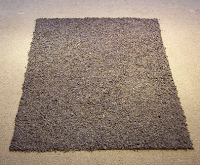
There are a number of works from the exhibition that stick out in my mind. For example, there was a large carpet-esque spread of black alphabet noodles, which looked like letters fallen from the page of a book. At first glance, it’s hard to notice that the black void is made of tiny letters, thus referencing minimalist works by artists like Ad Reinhart, with his entirely black paintings, and Karl Andre’s copper squares that lay on the floors of institutions like the MoMA. But given that that connection is rather esoteric, I was glad creator Adam Bateman was there to shed light on the piece. Bateman said that the piece is supposed to make you question the meaning of words, letters, and symbols. When taken out of context or removed from their supposed order, they become arbitrary, or if nothing else their meaning changes entirely. More broadly, Bateman said, “My work has questioned the relationship between language and objects, especially art objects…”

A more personal/emotional work that I found interesting was a series of three pieces by artist Andy Monk. The works were floor plans of his former apartments made of matches that are stuck into plaster. After Monk moves out of an apartment, he creates a new work for the series and then burns the matches as a sort of "happening". It reminded me a lot of a pre-Passover custom to symbolically burn your sins, as a way to move forward. Clearly Monk’s old apartments aren’t sins, but the point is still the same, about closure and moving completely into the next phase, or stage. What remains of Monks works after the burning is plaster adorned with used matches, which deteriorate over time - just like the memories from those spaces fade as time passes... The work is sad, and perhaps a little bit harsh, (particularly in the case of his family home, which he moved out of after his parents' divorce,) but it’d so well thought out and filled with so many layers of meaning that I couldn't help but be drawn to it.

On that note, I try and live by the motto that I will always learn something new from, and see something new in, a work of art no matter how many times I look at it, but I must say, sometimes it’s just nice to stumble upon some fresh, young talent—to see art that truly embodies an innovative way of viewing the world…
Wednesday, September 15, 2010

When Religion and Art Are One...

Check this out! Architects from around the world are currently competing for most appealing sukkah design. Twelve winners have been selected to have their sukkas fabricated and placed in Union Square for all to see until October 2. Through this process, people have the opportunity to learn about different types of architecture and to think about the meaning of this ancient holiday, which in the contemporary idiom serves to remind us how lucky we are to have such bountiful harvests / so much to eat, and remind us of our obligation to help those less fortunate than us, though who might permanently live in temporary shelters... Talk about how art can be a vehicle that adds meaning to life...

P.S. In my book the 900
sukkah will always be the winner!

Sunday, August 1, 2010

Performance

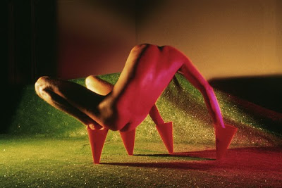
Jimmy DeSana, Marker Cones, 1982. Silver dye bleach print. Whitney Museum of American Art.

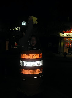
Yesterday Mitch and I visited the Whitney Museum of American Art, where there's currently an exhibition on performative actions captured through photo or drawing. We particularly liked Jimmy DeSana's Marker Cones (1982), which you can see above, because it reminded us of an experience of our very own, which you can see below.

I initially loved the idea of capturing the essence of a performance in a snap shot, but after seeing DeSana's work and recalling all of the laughter brought about by getting stuck in a traffic cone with Mitch one silly college night, I was reminded that a still can never capture the full range of emotions that come with an experience. I'm not sure if that revelation was disenchanting in the sense that it made the exhibition less meaningful to me, or if it just meant that the works in the exhibition were a type of art other than performance, but it certainly made me nostalgic for my good old UofM days for the first time since graduating nearly a year ago...

Thursday, July 29, 2010

Meaningful Conversation

I just finished reading Richard Polsky's book I Sold Andy Warhol (Too Soon). On the whole I found it a bit kfetchy, (winy if you will), and cathartic in the sense that Polsky spends the entirety of the book recounting the history of the rising value of Warhol's Freight Wigs to ultimately make the point that he could have made more money had he been patient and not sold the one he owned so quickly. (A story not unique to the art world, after all everyone has a should have, would have could have story...)

With exception to the book's great cover, the only other part of the book I found valuable was the following line: "Most paintings are like one-liners; once you get it, that's the end of the experience. The best works of art...reveal something fresh whenever you look at them (p.237)."

On that note, Mitch and I have begun what I'm calling "virtual collections." This means we've created photo albums on Facebook that contain images of works of art that speak to us in some way - images we are happy to look at again and again because of their aesthetic, symbolic, or narrative qualities. We're hoping this idea will be contagious and that many people will start creating virtual collections...

My father pointed out virutal collections are a form of "disruptive innovation." Disruptive innovation is Clayton Christensen's theory that innovations disrupt existing markets by creating products or services that are more accessible, and though they are often less powerful they are still good enough to get the job done. So, while virutal collections may not be as moving or inspirational as seeing the real works in say a museum, for most people they might be good to get the job done, good enough to encourage them to think about art!

Perhaps the best part of virtual collections are that they can provoke conversations that start with, "Hey, I saw that new piece you posted... What do you like about that piece? What's that piece about?" As apposed to, "Saw you hit up another party last week..."

After all, there's nothing better than meaningful conversation - supposedly it's the key to happiness!